Wags & Whiskers is an animal rescue that has adoptions but also does so with the help of volunteers, donations and memberships. The typical user is between 19-30 years old, and most users are college students or early career professionals. Wags goals is to be a fun, informative, and easy to use for all types of users.
Challenge
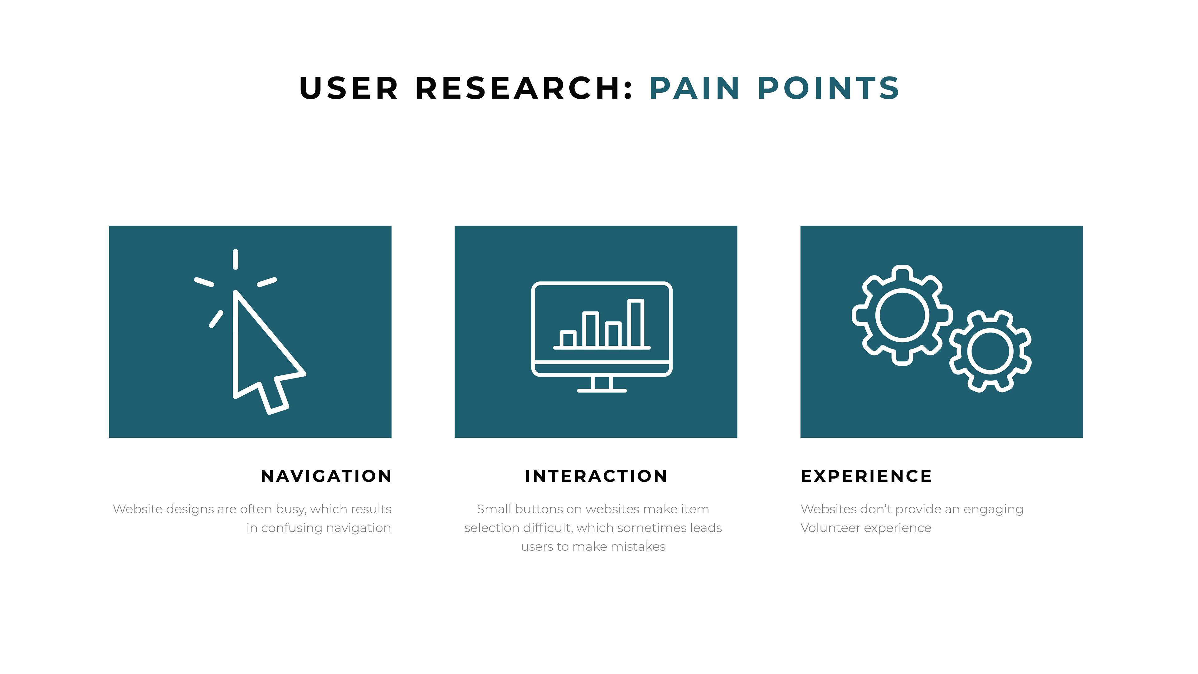
Available rescue websites have cluttered designs, inefficient systems and difficult to understand volunteer options.
Objective
Design a Wags & Whiskers website to be user friendly by providing clear navigation and offering an easy to maneuver volunteer section.
Research
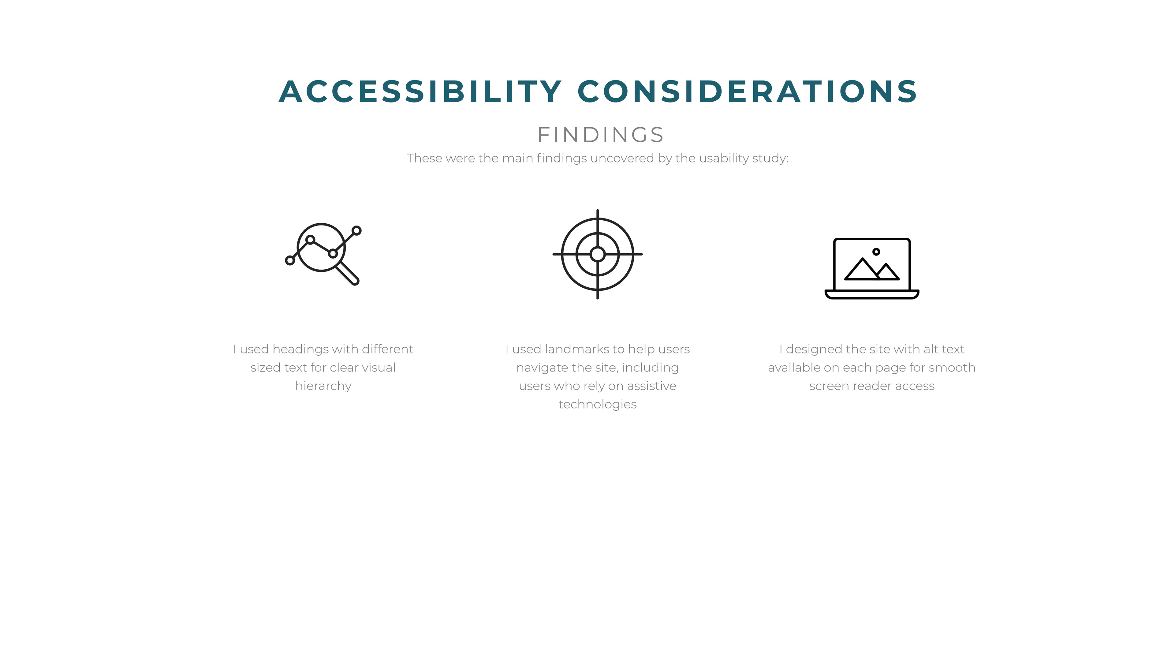
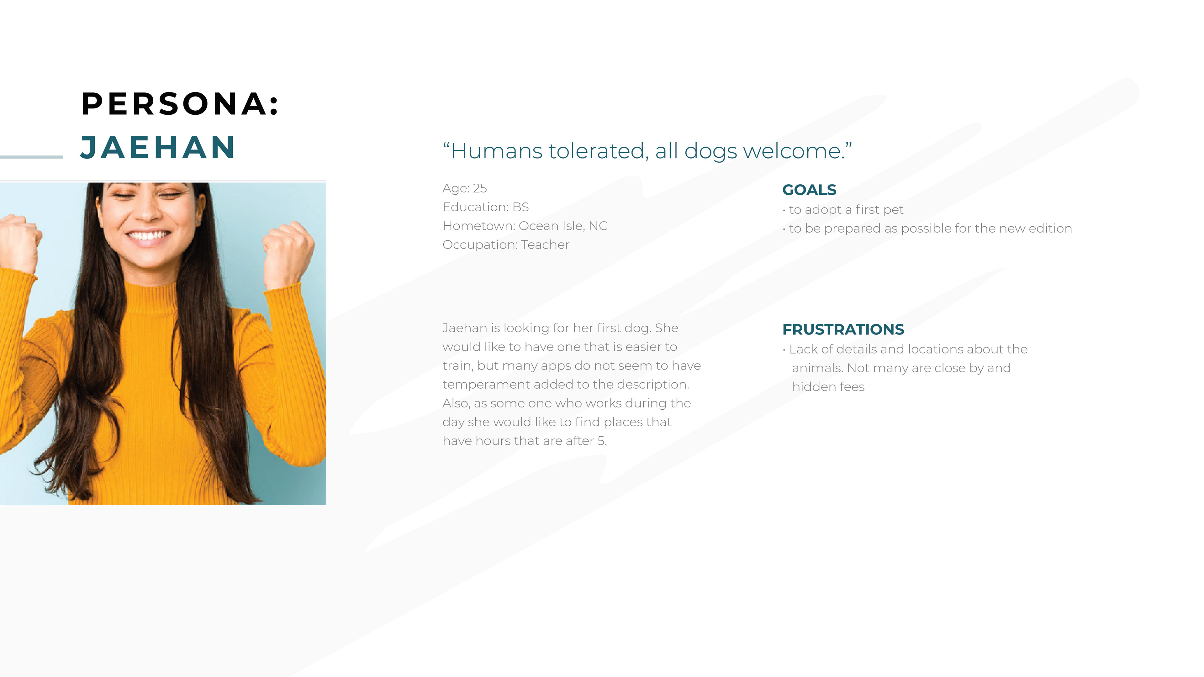
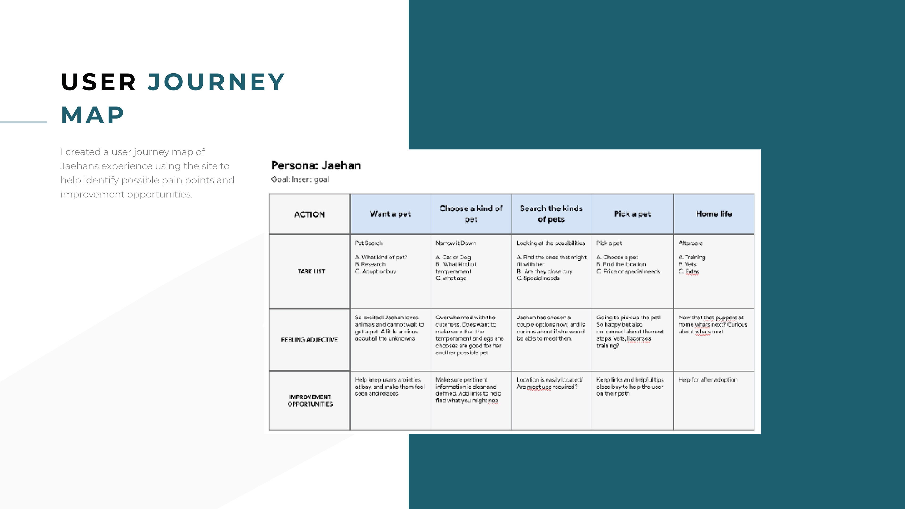
I conducted user interviews, which I then turned into empathy maps to better understand the target user and their needs. I discovered that many target potential volunteers really want to connect with the animals they are working with. However, many websites are overwhelming and confusing to navigate, which frustrated many target users. This caused a normally enjoyable experience to become challenging for them.
Researching the problem
I conducted user interviews, which I then turned into empathy maps to better understand the target user and their needs. I discovered that many target users treat online shopping as a fun and relaxing activity when they want a treat or plan for a special occasion. However, many bakery websites websites are overwhelming and confusing to navigate, which frustrated many target users. This caused a normally enjoyable experience to become challenging for them, defeating the purpose.
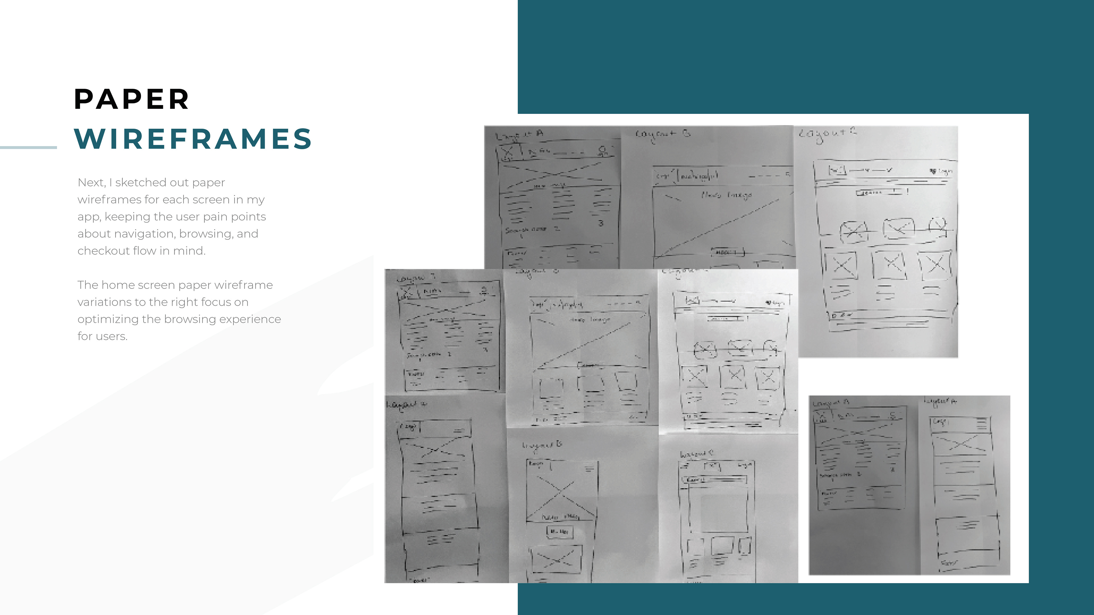
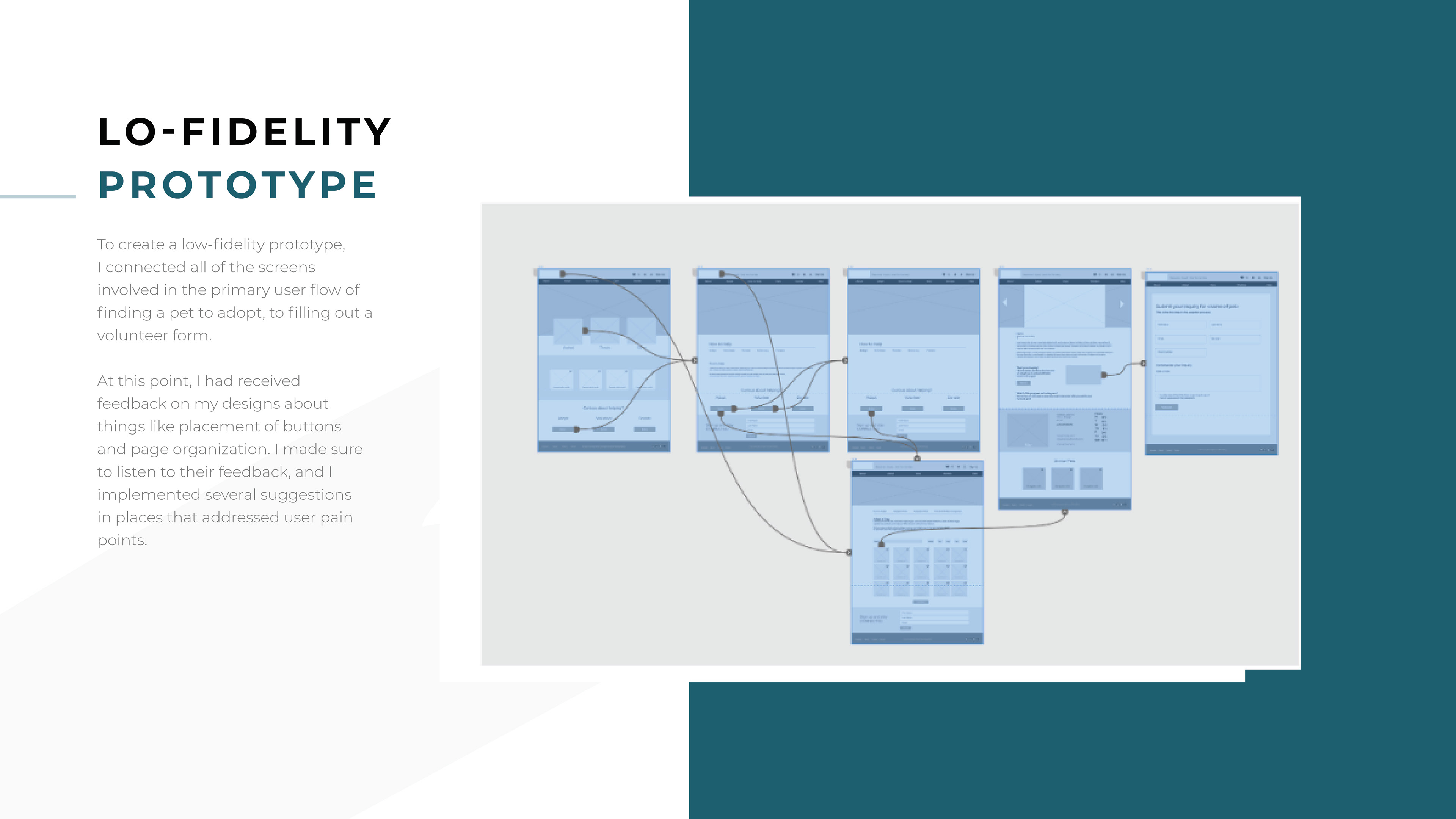
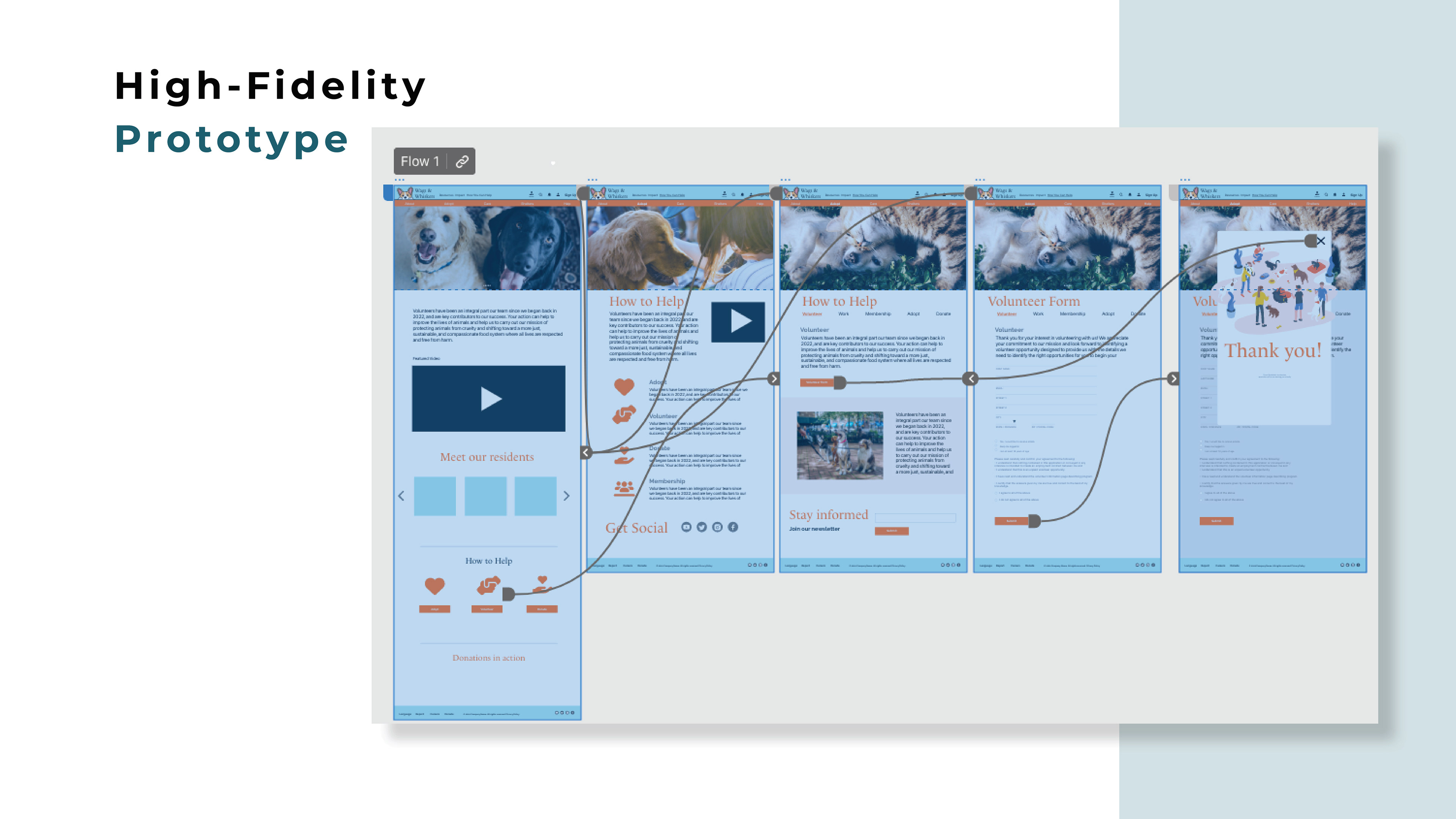
Design and Prototyping
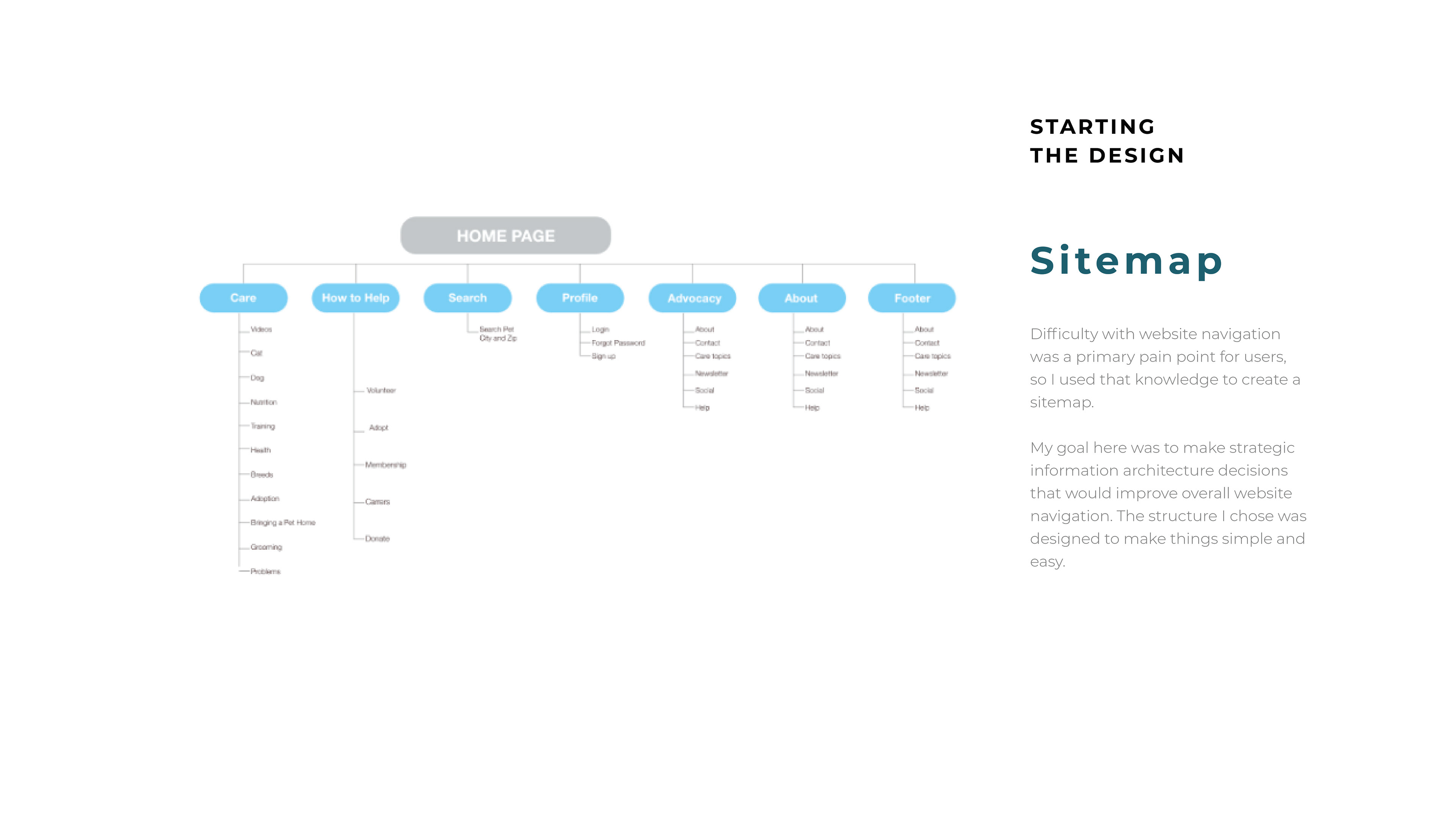
Difficulty with website navigation was a primary pain point for users, so I used that knowledge to create a sitemap.
My goal here was to make strategic information architecture decisions that would improve overall website navigation. The structure I chose was designed to make things simple and easy.
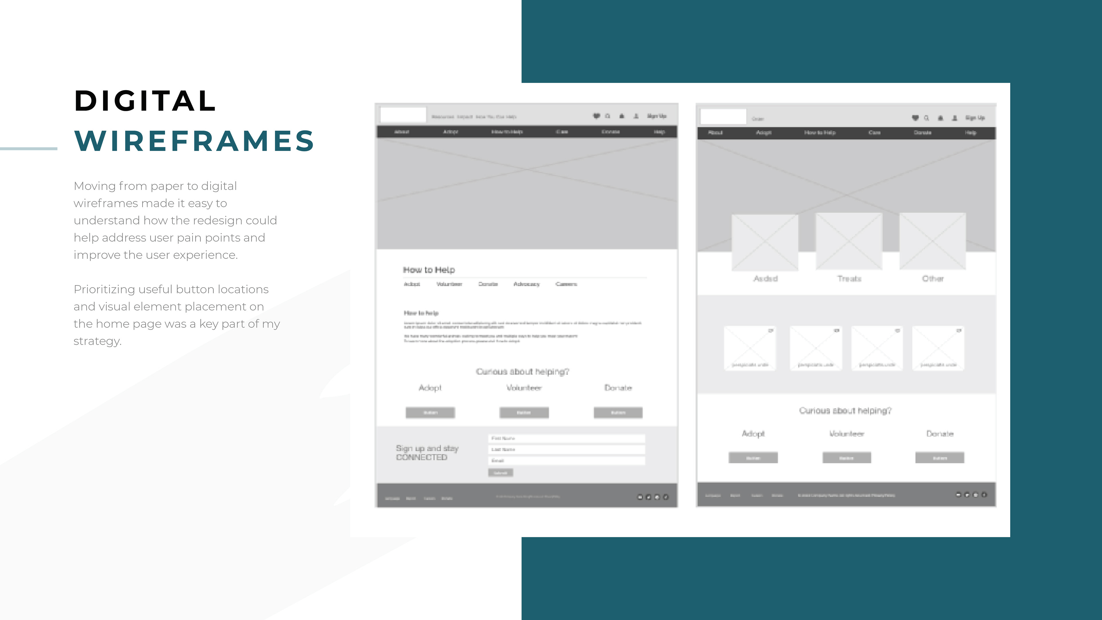
Moving from paper to digital wireframes made it easy to understand how the redesign could help address user pain points and improve the user experience.
Prioritizing useful button locations and visual element placement on the home page was a key part of my strategy.
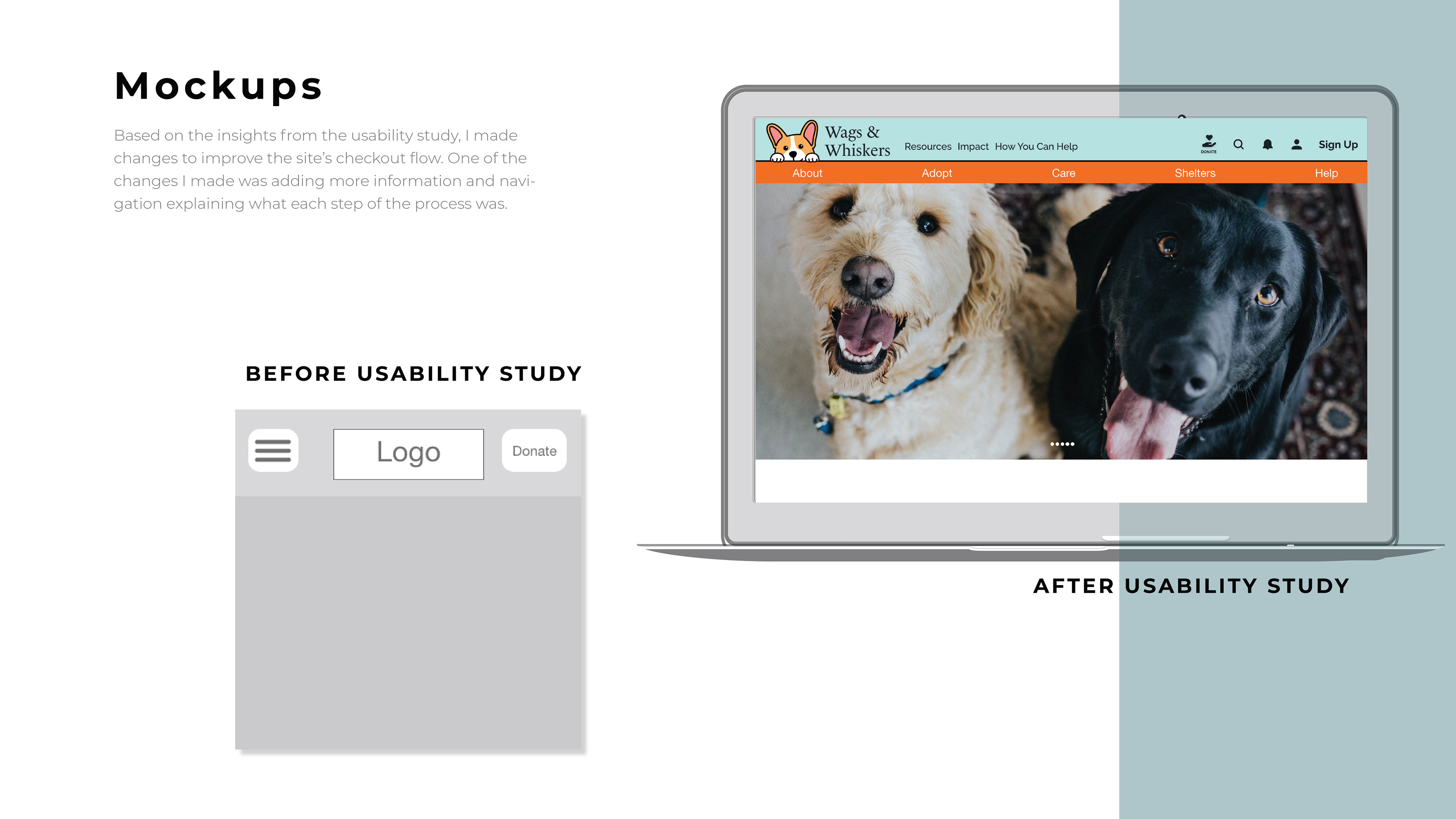
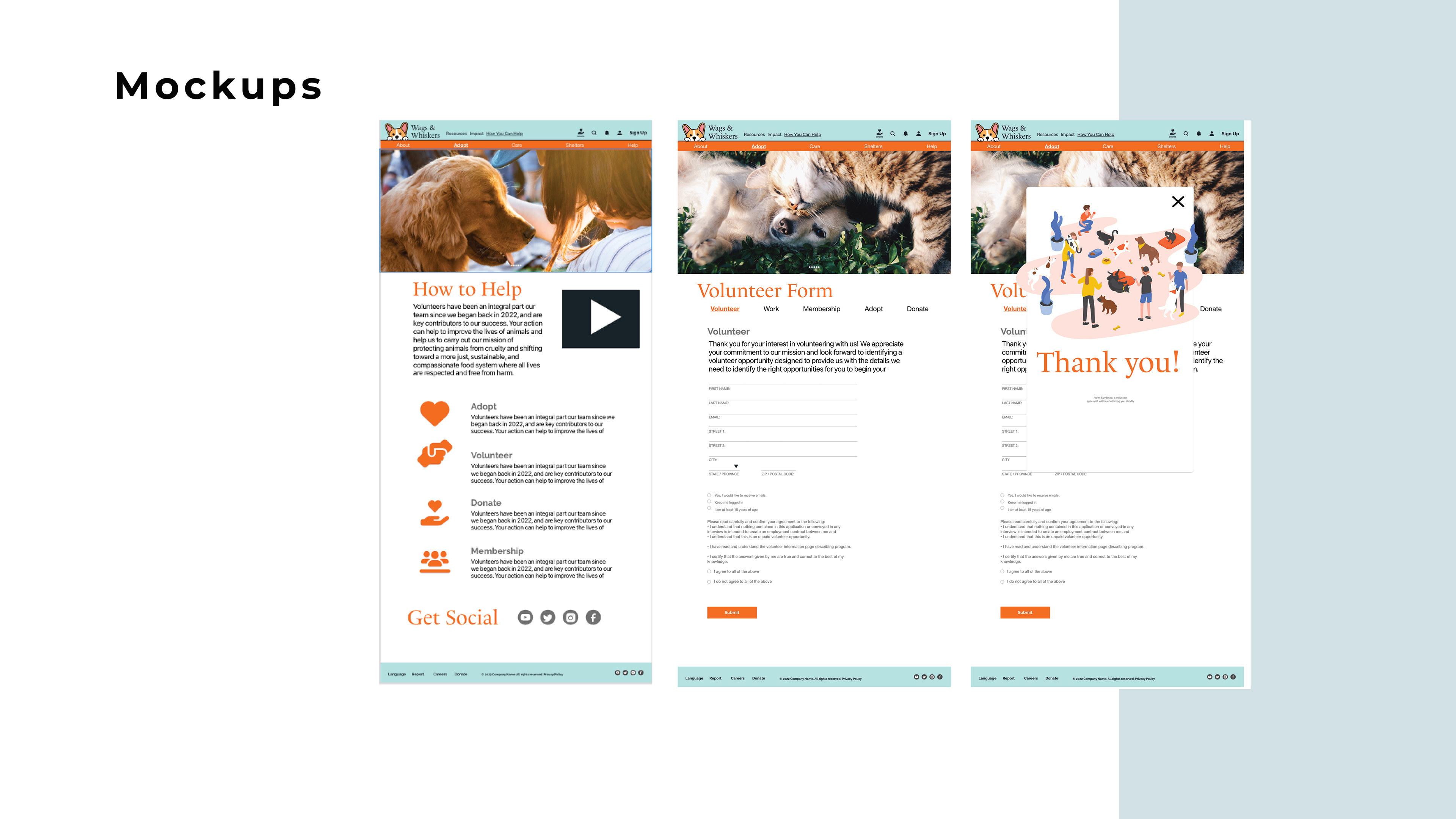
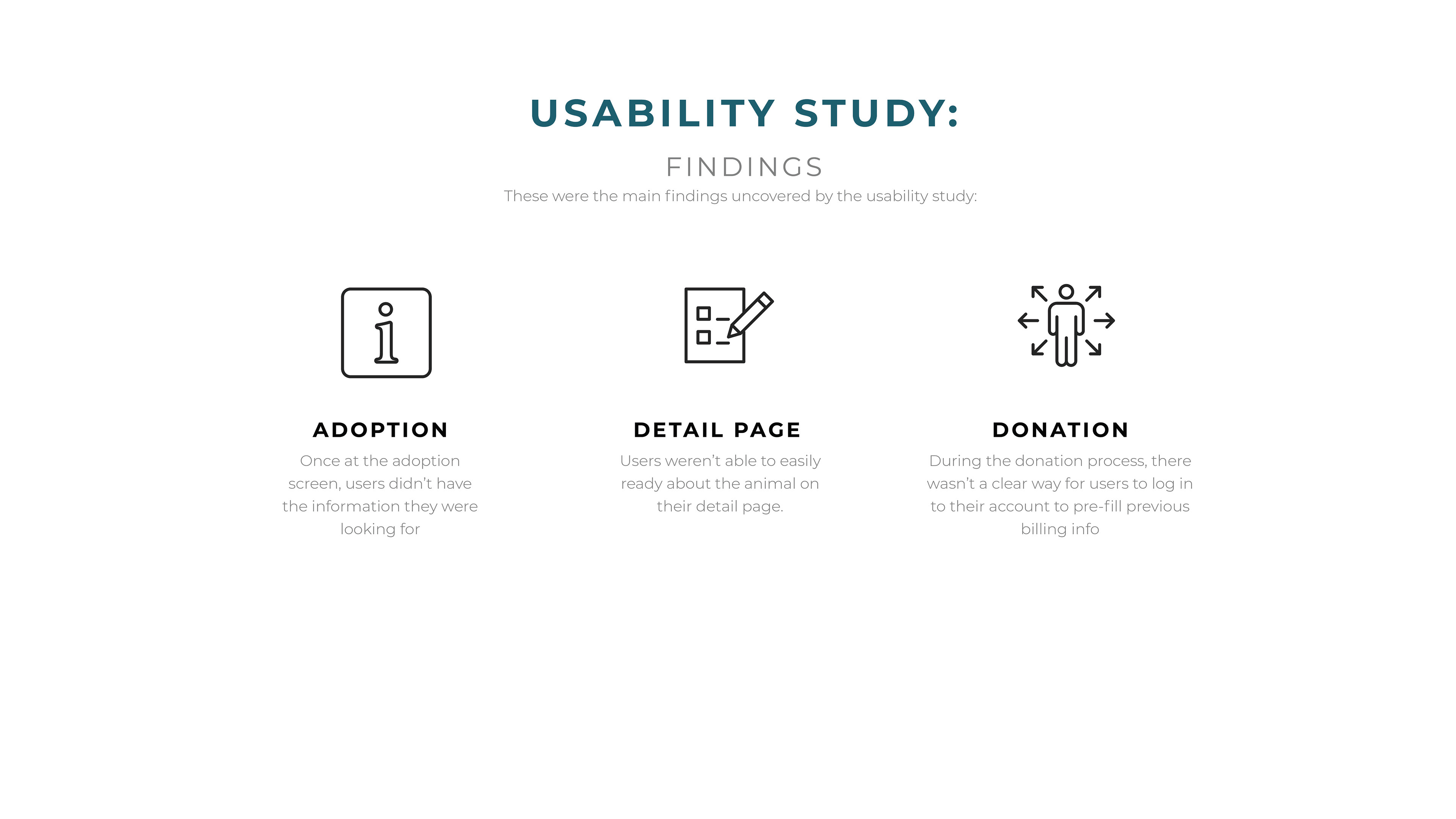
Based on the insights from the usability study, I made changes to improve the site’s checkout flow. One of the changes I made was adding more information and navigation explaining what each step of the process was.
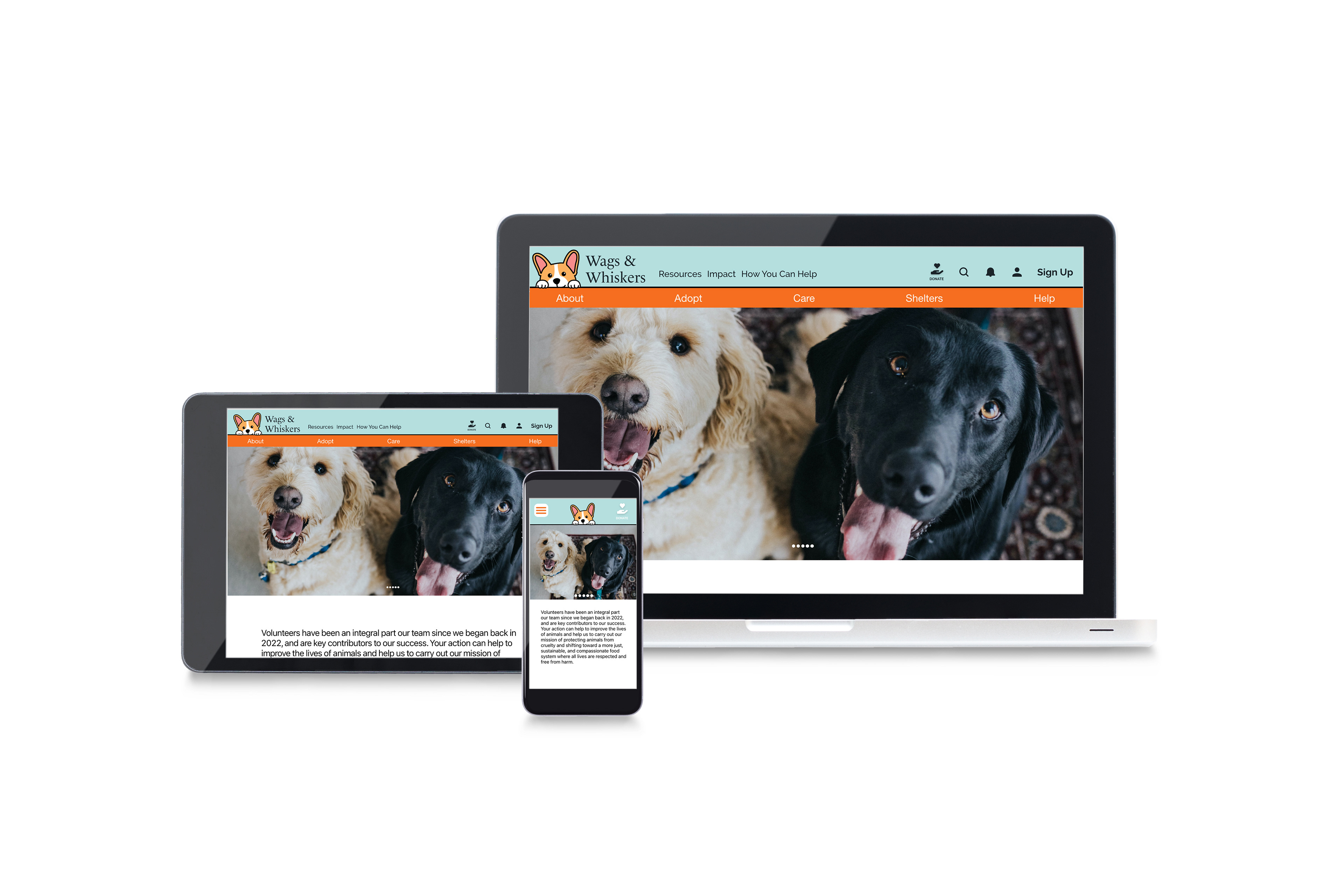
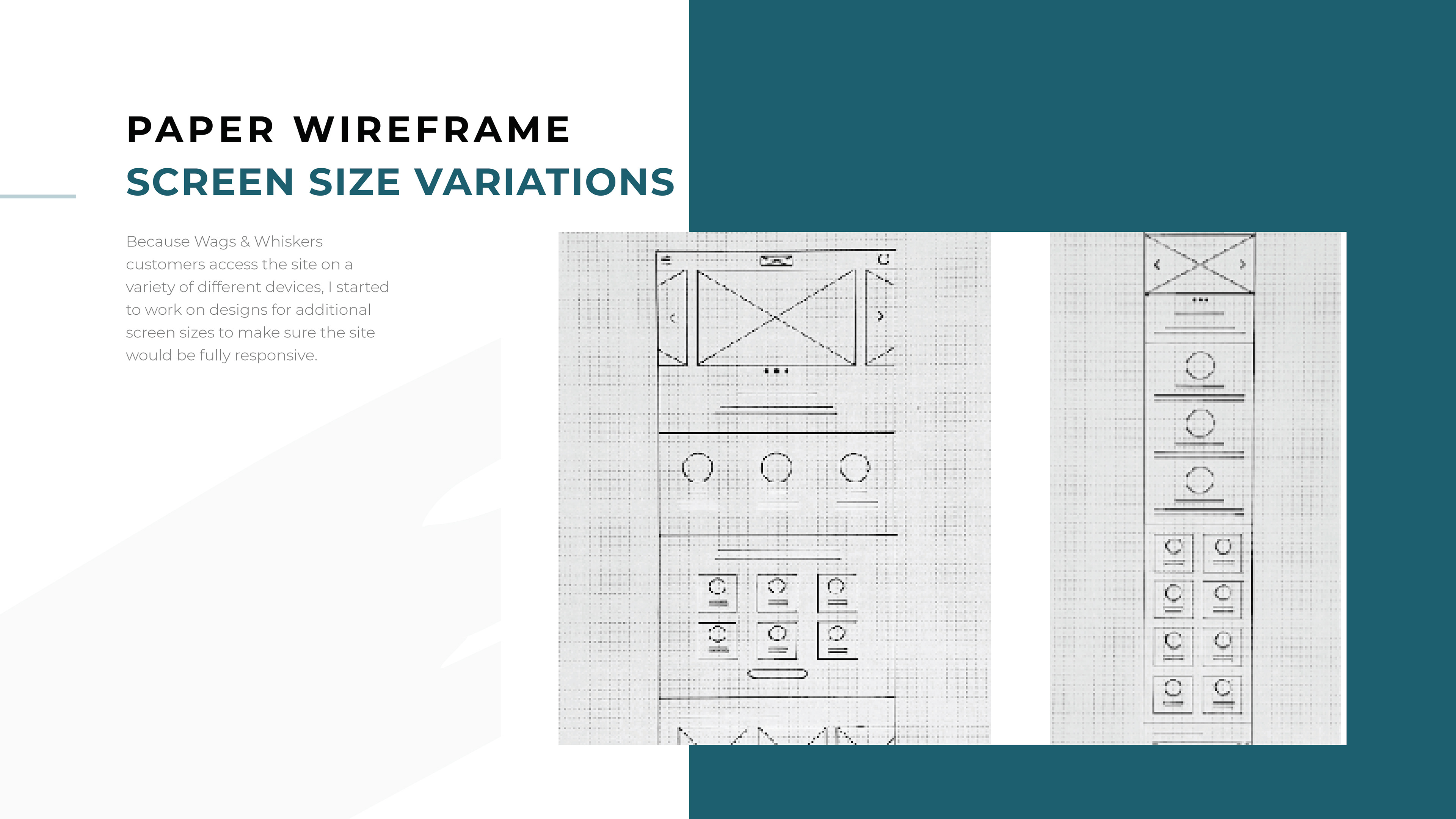
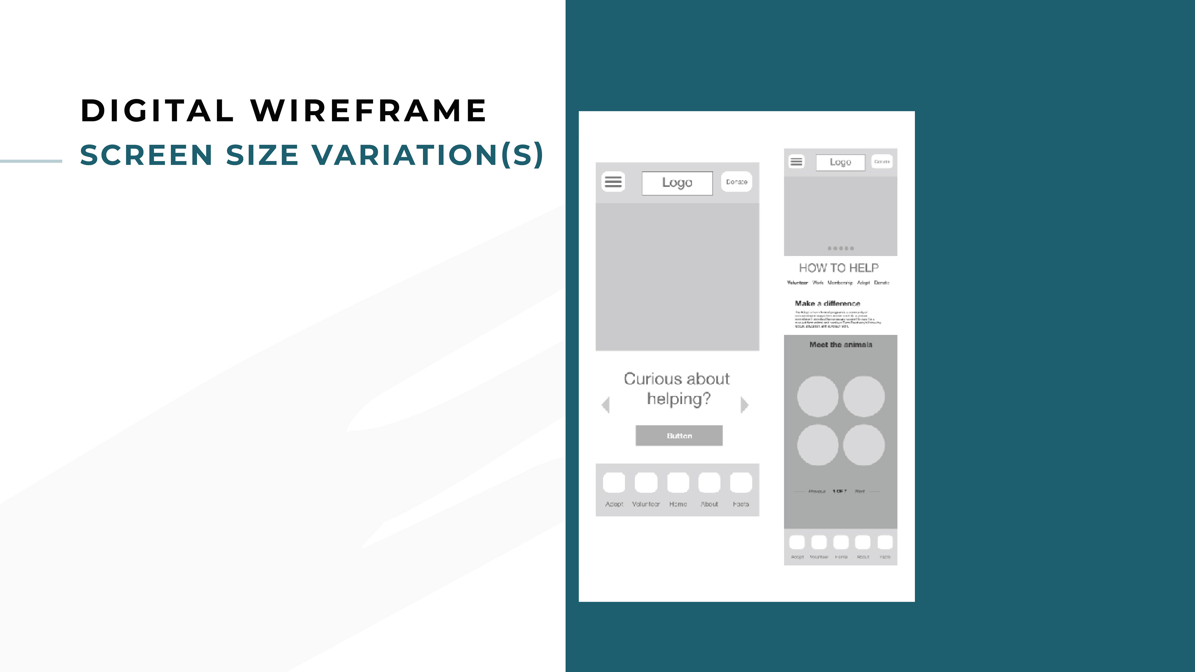
I included considerations for additional screen sizes in my mockups based on my earlier wireframes. Because users shop from a variety of devices, I felt it was important to optimize the browsing experience for a range of device sizes, such as mobile and tablet so users have the smoothest experience possible.